seaswap
Work In Progress
Comprehensive case study coming soon
Introduction
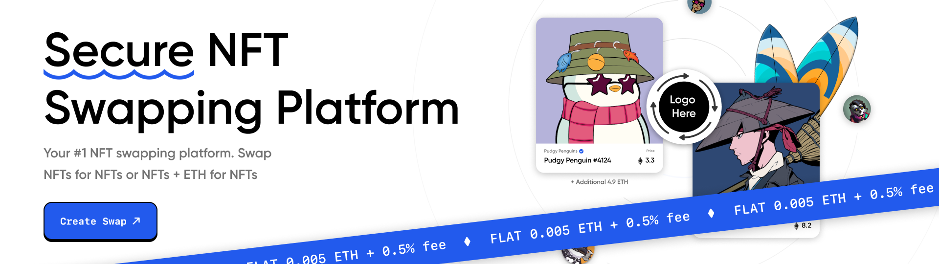
SeaSwap, a secure NFT swapping platform, is dedicated to providing users with a safe and intuitive environment for trading non-fungible tokens (NFTs). This case study delves into the design elements that define SeaSwap's unique identity, emphasizing the primary color scheme of white and blue, subtle ocean wave accents, and the selection of fonts - Gilroy and SF Mono. The pivotal role of the design team in shaping the platform's user experience is central to this discussion.
challenges
Complexity of NFTs
NFTs can be complex for new users to understand. Simplifying the process of creating, buying, and swapping NFTs while maintaining security is a significant UX challenge.
Onboarding and Education
Introducing newcomers to the world of blockchain and NFTs while keeping the onboarding process user-friendly and informative can be challenging.
Responsive Design
Ensuring a seamless user experience on both desktop and mobile devices, given the diversity of the user base, requires careful design and development.
Discovery & Research
For SeaSwap, a secure NFT swapping platform, the UI/UX needs primarily revolve around creating a seamless and user-friendly experience. This entails designing an intuitive interface that simplifies the complex processes associated with NFT trading, ensuring responsive design for both desktop and mobile users, and maintaining a cohesive visual identity with the chosen white and blue color scheme and subtle ocean wave accents. Additionally, user-centered design principles, clear navigation, and robust security features are crucial to meet the platform's objectives of simplicity, security, and user trust.
Logo Design
Ocean wave accents are tastefully integrated into specific design elements, providing a cohesive and visually pleasing identity that resonates with the platform's theme without overwhelming the user interface.

Color Palette
White is the predominant color, symbolizing transparency and trust, reflecting SeaSwap's commitment to security. The primary blue color represents reliability and calmness, aligning with the platform's ocean-themed identity.

Typography
Chosen for its modern and clean aesthetic, Gilroy enhances readability and adds a contemporary touch to the design. SF Mono ensures a consistent presentation of vital information within the platform.

UI Design
In conclusion, my role in the seaswap project focused on the UI/UX design for the homepage and documentation, which contributed to conveying seaswap's values while simplifying complex cryptocurrency processes for users.


